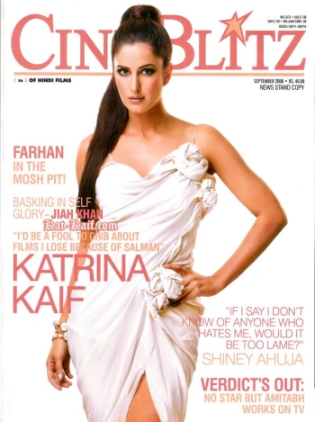
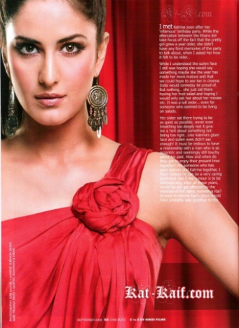
Katrina In Shantanu-Nikhil
I love Shantanu-Nikhil, but I hate rosettes with a passion, which is why I am neither digging the cover dress nor the red version.
What about you? Dig either of these or neither?
 |
|
 |
|
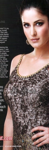
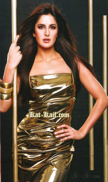
Katrina Kaif, CineBlitz September 2008

That she is beautiful- no doubt
that she is the new kid on the block – no doubt
That she photographs flawlessly – no doubt
BUT same pose, same expression and safe safe safe….point of being boring
Agree 100% with Adit on each point. I’d really like to see her in a fresh pose or facial expression one of these days…right now, its almost like they are photoshopping the same picture of her in different outfits over and over.
Also, I happen to love the rosettes, so I think that white dress on the cover is just gorgeous!
same expression + hair style + pose in first three shots , and in last one i only liked her make-up, she’s soo pretty & red color suits her a lot .
and rosettes i hate myself .
I like them all except the black one. You hate rosettes and I hate sequins =)
Or head to toe beading, either one.
@Adit: Ahahahahaa!!! Well same expression coz that’s all she can do with that pretty face (Rem she is just eye candy and can’t really act to save her life).
The photos are bland and way way too airbrushed!! The dresses are just blah too.
she looks pretty (if not a bit photshopped)
and I love Rossettes :) so I really like all of the dresses (and I must say, faux liquid texture of the last pic fascinates me)
However, it bothers me that all of her poses are the same, and I don’t like her hair or her earrings OR the styling of the photographs…I mean red on red, black on black, white on white? very uncreative
and then I don’t like Katrina-she’s seems like an impossibly dim (as in stupid) brat to me so :/
I like rosettes……..they have smthin to do with feminity and spring….she looks good….not the hairstyle…
She looks too photoshopped in all the 4 pictures.
Ewww Ewwww Ewwww looks like a badly tied TOGA.
Another Kiran in NYC
I love Katrina. I think it’s just the way she comes off – serious – that photographer takes her pics in the same manner. She looks soo much prettier wihen she smiles and in curls. . I hope she is potrayed different in the future. She should try Sonam’s photographers – LOVE tht girl soo much!!
I love rosettes – very cute. I love the red dres but not the white. Too many rosettes. Too much of anything is bad.
same old BOOOORING facial expressions. no matter how much she is styled, Kat always looks the same. no versatility at all. i hate the white and the gold dress. but don’t mind the red and black ones. Kat os pretty, but these pics r too evidently airbrushed.
B.O.R.I.N.G
Maybe its CineBlitz.. i remember seeing Rekha, sridevi etc.. in Cineblitz in the exact same gold dress as a kid:-)
my babe is here to stay! she looks simply ravishing here! i simply love love love her!
Kat looks pretty… but the dress is rather eww.
I wouldn’t go so far as to say she was beautiful – she pretty enough but with those ears and those shoulders a pulled back severe pony tail (circa Madonna during her pointy bra phases) is not working for me or her by the looks of the pics….
its all a bit blah
@anita: Funny I remember the Cineblitz with Rekhan in the gold dress too. Don’t like any of the dresses. If the white fit better then it would be nice but yes agree with “Another kiran from New York” – looks like a badly tied TOGA.
Katrina is just a normal pretty girl – nothing special without makeup and photoshopping. She is also bland and boring with her lifeless expression or frozen smile.
There are so many other girls who are more worthy like Lara who should be getting this attention.
BTW, not liking any of the dresses in this photoshoot.
The last gold outfit is nice! But the first thing I thought was “where’s my kat with the lovely innocent smile of hers?”
She has virtually the same expression in ALL her photoshoots. Her face is so blank. There’s no character in it.
i like rosettes too.. but i am not digging the white dress.. the red dress is alrite.. the last dress is like a blunder out of the 80s.. yikes!
that comment on the cover has me confused
her face looks so wooden and lifeless in these pics. maybe they lost something in all the airbrushing.
shes gorjus
but in the first three photos, she just looks too severe…like everything’s full stretched back and all. na….
however i do like the last pic.
she
is just
too beautiful for words
and she pulls off all the looks amazingly
She’s so gorgeous! Neither of the dresses is too great, but she carries them off effortlessly!
Katrina, I love u!
I love rosettes, bows, all things parisian 60’s, so i like the second dress. Not sure of the first one. Man they should get some snazzy people on covers already. This woman has absolutely NO PERSONALITY! Argh give me a crazy wild off gaurd moment you infantile magazine photographers and editors. Blah!