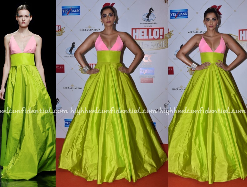
In Celia Kritharioti
At the Hello! Hall Of Fame Awards, Sonam was seen in a pink and lime green design by Greek designer, Celia Kritharioti. Going by Rhea’s post, the inspiration for Sonam’s look was Holi and while I liked the colors of the gown, I don’t think adding the blue eye-shadow worked here. It didn’t quite belong with the bright color palette of the dress.
What do you think?
|
Sonam Kapoor
Photo Credit: Viral Bhayani


Nope. Nope. No. This whole thing should never have seen the light of day or the the darkness of night for that matter.
LOLmax. You said it best! What the hell happened overnight? This dress is not for a busty person (going from the look on the model)
SOOOOO bad. WTHeyyyy for sure.
Her pose is also so bad…is almost like if she puts her hands down, there will be a wardrobe malfunction up top.
On the model I really get the design.. on Sonam it’s a whole different dress.
Exactly. Even the pink seems brighter. Looks so much nicer on the model. Also styling i think
Yes,it looks so much better on the model.The bodice is so tight,its like she cant breathe
Totally, What was so organic on the model looks so forced on Sonam
Why does her gown look like a DietSabya copy of the real thing? Especially the pink fabric.
This looks like an extremely cheap copy of the original gown. The styling is very try-hard too.
The gown is nothing too great to begin with and the styling is extremely dated. The colors are not flattering at all. Might have been better with minimalistic styling of hair, makeup and no jewelry.
The gown is nothing to write home about and Sonam’s hand on hip pose is not helping.
Ugly!
Nope.
I think this is one of those gowns that is good for editorial and OK to be photographed in controlled studio lights. However, the transition to the red carpet as evident is a horrid disaster. Plus Sonam striking that Pahalwan pose with the arms does not help.
she looks like a faded parrot.
It looks like the typical case of ‘ruined by camera flashes’. I wish the red carpet would invest in some lights so that everything did not have to be ruined by flash lights.
She looks top notch, although the bracelet looks unnecessary.
She is so good at dressing for her body type, but this was a miss in that regard – the fabric up top is not even wide enough! Had they adjusted it to fit her (maybe made the straps wider and hang over the shoulder slightly, it would have made this almost a non-issue).
Such a waste of a gorgeous colour…
This looks like knock off of original. Sonam is bursting at seams. Looks lovely on the model.
Can we get the pre-Veere Sonam back? All her major red carpet looks since VDW have been lackluster at best or really bad. On the model, the dress looks nice, but on Sonam, I have to agree the other commentators that it looks like a cheap copy of the original.
Whatthewhat is that? Dress itself is horrible but the makeup and everything else makes it worse. For a minute I thought the red lettering in the background is a bow on her head :-p
oh my, exactly what i thought too :D i thought it was a hair ornament.
Such an unflattering gown and ugly color..
Not at all good.
It looks on the model (though not a great dress to begin with) but has gone terribly wrong on Sonam. I think the colours don’t suit her and the pose is ridiculous. That is an awful shade of pink too.
Forget the red carpet pictures, Sonam isn’t selling this dress and styling even in her instagram pics.
She shud not have used the flared version of the gown
Makes her look big
She looks like a chest bearing fighter of sorts and I am sure that isnt what she intended. Hee gravity defying décolletage does not look good .
The way dress became tent when Sonam wore it is infact comical. They should have left it as it was on model.
These sisters need to “calm down”
So agree
This is so bad…the colour combination is jarring and not soothing to the eyes, the neckline makes Ms Kapoor look too broad, the makeup is ashy…its a major major fail on all counts.
She looks like the topping on a birthday cake that little girls usually pick . A doll statue and not in a good way !
Not buying it Holi or not
I like this…the blue works in the spirit of color blocking. Its fits her well too. What is odd is the choice of necklace and earrings. But for that, this is a good look. Might not be a memorable one. But good, yes.
Are we even looking at the same pictures? Where is the necklace you are seeing????!!!!!
Tacky gown, and bad make-up.. the pose doesnt help !
Color combo isn’t as earth shattering as social media is treating it. How many of us colored our princess coloring books with these 2 crayons?! the fitting and material is dreadful.