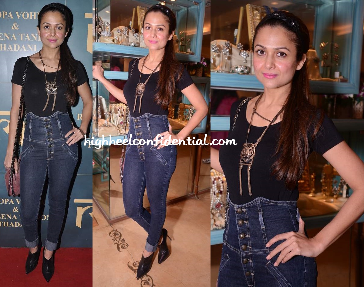
Denim Disaster
Ms. Arora’s lost quite a bit of weight but with it, it seems like she’s also lost her sense of fashion. Those high-waisted denims were just disastrous!
Burn, baby, burn! Into a real inferno!
|
Amrita Arora at Roopa Vohra Raveena Tandon Jewellery Line Launch
Photo Credit: Viral Bhayani


M i the only one to see something more then intended in first pic?!?
While her sister looks better skinny, she looks dull and tired. You can tell by looking at her that she is on diet.
BTW this text box is HUGE. I am almost giving up on commenting. I used to like that I could read other people’s comments while putting my thoughts together.
I like your blog not only because of the pictures you guys put up but also for the visitor’s comments. Now the blog is focusing more on what you guys write, which can be boring after a while. You guys need to make it more “comment friendly”
Also , I really like the new layout, now that the black bar at the top is gone. The new page is open with more breathing room.
Exactly. It is the same sentiment here.
She looks tired in these pics and those hideous jeans are not helping either. These jeans belong in WTHeyy and they’re just irritating to look at the more you look at them.
What the……!!! That flower embossed head band, the tiger pendant , those god awful denims and that bag, everything looks so cheap. She looks like she could first use some sleep.
P+P, please make the background black again. The layout is cool but the white back is too too bright. Eyes hurt.
i know things change but i thought i’d put in a polite request anyway..
thanks x
Yes, please. I do like the layout, just preferred the black background, especially with that paisley/brocade-ish print. it was way easier on the eyes.
ugly jeans. too bad for her.
Yay! You got rid of those pesky ads under the photos! I like your new format – very clean looking.
Btw, dislike those pants – it’s like the designer was wanting to do go with a skirt and then decided it was a pants day. Ugh!
Your new layout seems more disastrous to me than her look.
Nooooooo I don’t like this new layout….. :-(
This white background hurts the eyes. The focus shifts to the background instead of clothes. Bring back a darker shade background!
Not that I dont like changes but the black background was better to highlight the pictures and it felt so much home. Not liking the new layout:(
Please bring back the black background. This white is blinding my eyes. It doesn’t even feel like HHC anymore. It’s like I came home in the evening and someone painted all the walls a strange alien color. Give me my home back!
@RS took the words from my mouth.
The white background is a visual irritant. Apart from being easy on the eyes, the black one was so distinctive and something I (and majority of your visitors as is apparent from their comments) associated immediately with your blog. Please P & P, let us have our good ol’ backdrop back. Is it too much for us loyal followers to ask for?
Really agree with the rest of the comments.. The white background is just too meh… And earlier without zooming also we could see the pictures clearly…
White is boring, and absolutely dull nd a big turn off
I was surprised by your comment here P&P. “Ms. Arora’s lost quite a bit of weight but with it, it seems like she’s also lost her sense of fashion. ”
A little on the mean side given you are usually critical and yet polite.
Agree with the rest on the background – black was better.
Completely agree! You guys always had a certain poise and dignity with which you criticized people, mostly constructive criticism however this just comes across as plain mean! The outfit is a disaster that much is true but I dont see the need to be mean