Ash In Vogue: (Un)Covered
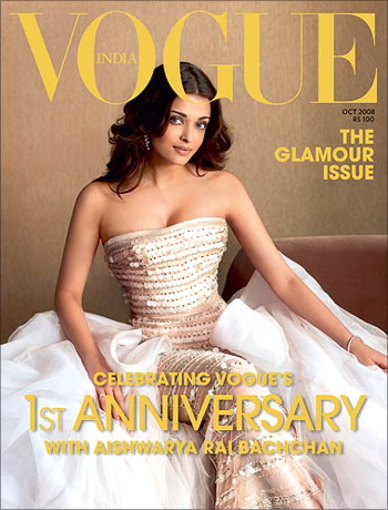
What do you all think of this cover? I quite like the understated old-world glamour and the earthiness of the cover…
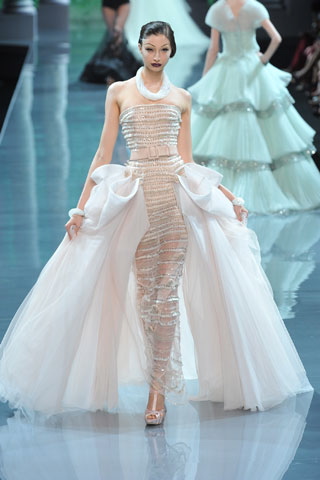
Update: Aishwarya is in Christian Dior Couture, Fall 08 and have added the runway picture.
Thanks ‘Sweta’ and ‘Tehzeeb’ for the tip-off!
|
Aishwarya Rai On The Vogue Cover
|
Christian Dior Couture Fall 2008
Photo Credit: Vogue India


i like it.. it’s serene.. change from over the top covers in last year.
i am not liking the pose that much.. but overall. nice
I think the cover is very representative of Vogue India i.e. unimaginative. I think they’ve lost a fantastic opportunity to do something different with her, especially since she too tends to play it safe most of the time.. Ash doesnt need vogue to make her look like this…she does this pretty well on her own. & this for what is supposedly a ‘the glamour issue’.
So unbelievably boring and bland.
BROAD SHOULDERS AND THIN WAIST LOOKS PHOTOSHOPPED TO ME
she looks gorgeous, loving her hair! something different for her. But the expression seems a bit pained. outfit is lovely
I guess the G cutting into her forehead is creating the illusion of the pained expression
I am in two minds about this. I like her being muted and earthy (as earthy as she can be), but may not be the perfect image for a glamour issue.
Grades
———-
Hair – B+
Makeup – A
Dress – A-
Jewelery – A
Overall – A
They forgot to add it..it’s THE “UNDERSTATED” GLAMOUR ISSUE”
the best cover of vogue india glamour in a simple way! very pretty
WOW!! She looks amazing!!
Ash is one celeb who has NEVER EVER NEVER looked bad…I’ve yet to see her looking bad, I don’t mean in clothes I mean just her!!
Liking the outfit and the tone of the photo
Like the earthiness. Love it. But Ash’s expression is a little pained I agree and her shoulders look really broad with a very small waist- looks very odd. Nice cover.
Very dull and boring. This cover shouts UNGLAMOROUS. Ash can look much more glamorous than this.
I dont like it. Aish is a gorgeous woman, but the cover looks depressing.
1. Her hair looks flat. Might have looked better if they had tied it up or something.
2. Her face looks like she is ‘plain bored of the photo shoot, but is trying to be professional’, Maybe a smile or a hint of an expression might have worked wonders.
3. The dress is ok. It looks like she is wearing some ugly sequined thing and sitting with some ruffled fabric around her.
Something is missing here. A cover should be eye-catching. I wonder if this would have looked in black and white..
Simply beautiful. This is understated elegance. I was so sick of seeing the covers with the model wearing too much makeup and so airbrushed that the person was unrecognizable.
This is old world glamour not ‘loud and look at me’ glamour. Bling is now boring.
the dress is a Dior couture fall 2008
lol i think :P
can u plss put more pics up??
The dress on the runway looks unreal!! And the unimaginative shoot manages to make it just about ordinary, pretty yes but ordinary.
Now that you’ve added the catwalk pic this is looking all the more blehhh! Given how her pic is taken, I thought she was sitting on white starched fabric.. not for a moment did I think it was part of the dress! Also, when people talk about old world glamour its Dita Von Teese that comes to mind… not this.
I am really on the fence about this. Its definitely nice in a simple and minimalistic way…in a less-is-more kind of way. She looks very beautiful here too…as she always does. I think I also get the “old-world glamor” look. BUT I think this too closely resembles Ash’s own style/fashion sense. I am really waiting to see Ash in something edgy…something a little fashion forward and with a little more risks. And if not Vogue, how else or where else??
Bottomline — Its OK (shrug of the shoulders!!)
OMG, Ash looks so freaking gorgeous. Love it all.
For clarification, Dita Von Teese’s look is burlesque – also called retro pinup. That is not old world glamour. There is a difference.
Something is up with her hair. It’s terrible. The cover comes as a dissappointment, being anniversary issue and all.
I don’t know why but this looks a bit awkward… I like the dress and styling (though the hair could be different )but this could have been taken in a million different ways but they chose the most blah! why must covers be so under potential.. they had the model, the dress, the location.. and it’s so.. *sigh*
@ Carol,
Ok, I know this sounds like two kids squabbling.. BUT I have to say this – Burlesque is an art form… and Dita is a burlesque ‘artist’! Her look itself is very glam’d up 40’s inspired… by which I mean neck up.
bland..
I thought the white fabric around her was just some satin prop. Now that you have given the runway edgy quirky gown pic, ash’s pic has just sunk way below. Vogue cover doesn’t burn me.
THE INSIDE PICS ARE SOO SOO MUCH BETTER. WHY DIDNT THEY USE THE LOW BACKED GOWN ONE? THIS IS NICE BUT BORING…
Disappointing. They could have done something ‘wow’ with Ash…sigh.
it’s nice…very a la Grace Kelly
Ash, of course, looks as fabulous as always, but the hair could have helped (make it look more Grace Kelly-ish)
and i have to agree with Carol, Dita (who I adore) is into pin-up fashion although she is definetly old world and glamerous, she has an edge
old world glamour is more Grace Kelly/Audrey Hepurn
Ethereal Aishwarya!
bland! boring! blah! they could have done so much better..tsk.
Very boring, very very average.
Any random magazine could have come up with this cover. Nothing Vogue about it at all.
Ash has been spiraling into blandless for a long while now and it continues here too. I don’t even see her “beauty” here. Just an okay looking woman on this cover.
this has to b the simplest cover of its recent times..
yet it leaves an impact..
i do think ther is sumthin wrong with the pic..her body isnt like tht..or mayb the way she’s sittin or sumthin…i dunno..but sumthin seems off
very boring. Ash looks boring too – and why are her shoulders so broad in the picture – her body looks different.. and i hate her hairstyle – she looks old.
Given the controversy of the August issue, maybe Vogue is trying to make amends with the understated Sept cover.
Love it…she is an International – Indian star….and looks the part…confident, beautiful and well put together….good job Priya/Anahita
finally someone with class and sophistication on the Vogue India cover.
It is very understated as everyone said and yet it makes a huge impact unlike those other over the top covers in the past
she shot for the cover in London while she was there for the tour..
Great…I added this to my site earlier today after I a called Vogue India, who’s office is in London, and they told me the designer of her dress.
Did you call them too?
Fashion Critic
No, we were tipped off by two of our readers.
xo
I like this photo. Simple, Sophisticated and classy. Ofcourse they can do better with Ash but that happens all the time. This picture is projecting her more as a mature woman who is confident and independent rather than an actress or a model hoping for more Fan following.
She’s such a natural beauty. Appreciate her for what she is.
does anyone have the pictures from inside the magazine referenced above? would love to see those…
i say again, MODELS MODELS MODELS!!
Although i like the gown and yeah like someone mentions broad shoulder, clinched waist. Bad PS!!
no but if you go to ndtv website and look under entertainment videos you’ll find interview w/ stylists and herand they show the other pictures (stunning and classy as always)..
Cover is simply superb.Ash is glowing and stunning.I will buy this issue only for the cover picture.
you knw.. its not her! its the background thats so bland!! why did they do that? it doesnt do anything for her or the stunning dress! plus her pose doesnt even show off the best part of the dress ie the frills!! argghh
Its always interesting to note that any ash post gets the maximum comments!
i think one thing we are forgetting here is – this is VOGUE!!! how can you have such a plain feel to the cover and call it “the glamour issue”. and, honestly, aishwarya is not helping either. i have never seen her as a role model for “glamour” so i am disappointed. anyhow, a model like laxmi menon who is the face of hermes is ignored and we just hog bollywood stars to teach us glamour…not expected from VOGUE…maybe filmfare, NOT VOGUE…but, then maybe..its VOGUE INDIA :)
Yes, I like what someone said above about the magazine projecting her as a elegant woman who is confident and accomplished.
She is Aishwarya–no need for flash and glitz! You only have to see Ash!
i think her makeup could have been a notch better.. but still the mag cover looks great because she is so beautifull.. but this is definitely not glamour.. putting a high profile designers dress and posing is not glamour
first thing that came to my mind- bland … and then boring …
and that too for the ‘glamour’ issue.
Vogue india is definitely in the running for the worst covers ever. Are they completely insulated from the rest of the world- don’t they have any idea how their covers are trashed on every blog/ website.
A cover is supposed to tempt you to stop and buy the magazine when you are rushing past the newspaper stand.
Subscribers apart, can anyone honestly say that they would have picked up this magazine on first look alone.
I get what ppl are saying about understated elegance but the colours/the makeup/the horrible brown background – it just makes me yawn.
I must say a lot of comments so far have been extremely, overly analytical. Relax guys! It’s just a magazine cover, not Volume II of Mein Kampf. Geez.
Aishwarya looks great on the cover! Vogue has done a good job in keeping the cover simple and sophisticated.
At least we now have one Vogue India cover worth looking at. I can’t wait to order the issue.
People are loving her look in this other non desi celebrity blog i go to.
I love the photo but i do feel like all Vogue India has been doing is putting random famous people from bollywood in labels and hoping that would sell. There is nothing really striking or strong in terms of pictures or content that makes me buy the magazine.
There is nothing understated, elegant, or old world glamor about this cover. It’s just bloody insipidly boring. Rai always looks boring. If it actually were all the things listed above, I would have been the first person to buy it….