In Shivan And Narresh
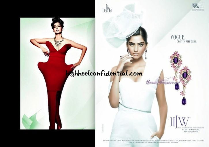
Being the face of India International Jewellery Week meant a print campaign too. And for the shoot, we spotted two Shivan and Narresh outfits on Sonam, which we happened to love; we thought she looked great. The clothes made for a great foil (for the jewelry) without having to be boring.
|
Sonam Kapoor For IIJW 2011
Photo Credit: Sonam-Kapoor.Net


I don’t like the shoot. They do no justice to the garments.
But these ads aren’t about the garments at all… I am not so sure about the need for the red dress…would like to see a better picture of it.
But I have seen the other one in a magazine, and I think it showcases the jewellery quite well.
Agreed. But I still think it’s important to show the garments in a positive light. I mean I understand it’s a jewelry ad and all but if you’re going to source garments from designers to use in your shoot, even if it isnt what the shoot is concentrating on… You should still try and make it look good because that’d only improve the image even more.
But I totally get what you mean.
Funny…the red one reminds me of a couch!
My thoughts exactly! She looks like a designer chair!
i agree!
LOVE!!
I like it..we usually dont see much structured outfits coming out of indian designers so this is a great way for ti to bring to international jewlery week:0
the red one is just strange…
lol….i thought so too..thr is fashion and thr is stupidity…
the red dress looks like she is standing behind a cut out , does not look like she is wearing a dress.
rightly said..
The red dress looks like its been inspired by the Arne Jacobsen egg chair, google it and you’ll see what I am talking about. Needless to say it look really weird. As for the second pic in white it doesn’t quite look like Sonam. Photoshop much?
the dress does look like the egg chair… quite hilarious!
OMG…U r right !!!!
hahahaaa you are right.. i looked at this picture of sonam again and burst out laughing… it’s ridiculous, agree it’s a print shoot, but thaaat dress does not make sense!!!
The jewelery ads in India are getting funky! Love!
The red one looks like a caricature. Even though the dress is interesting and strange, it doesn’t do well for the campaign. The white one showcases the jewelry well.
its just a horrible shoot. the model, the clothes, the jewellery nothing looks right.
hmmm i think you say nice things about her because you seem like twitter friends. because its pretty obvious how average this shoot is.
How are you supposed to wear the red outfit and do anything but stand with your arms stretched out?
only someone like sonam can do justice to the red outfit. She is amazing, way ahead of the fashion scene in India. This ad is what one would see in W magazine.
She looks like Aishwarya in the second pic. Beautiful campaign!
I just can’t seem to like the lower half of the red gown.. So narrow
I cant imagine anyone trying to walk in it without looking like they are dressed up as a chilly or something!
Is it necessary to say that the red one looks ugly at the hips? Her hand on the hip just brings attention to it and ..both images are a bit too posey and I think she could have shaken off the headdress in the white
Sorry, but the pics have been retouched wayy too much. I had to read the name below the pic to know it was actually Sonam!
The first pic is really, really **bad**. Why?
Because
a) Its one of the biggest crimes a photographer can commit: To practically cut off the feet from the pic.
b) Sonam’s pose is veeery weird. As is she were adjusting the position of her dress.
c) Plus, IMO she’s looking older than she is.