On The Runway
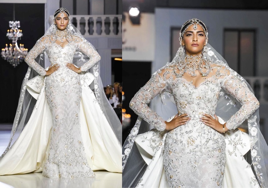
Instead of being front row, Sonam served as a showstopper for designers Ralph & Russo at the Haute Couture presentation today in Paris. Are you loving the heavy bejewelled bride look?
|
Instead of being front row, Sonam served as a showstopper for designers Ralph & Russo at the Haute Couture presentation today in Paris. Are you loving the heavy bejewelled bride look?
|
|


So from now on , you will skip your opinion and ask us ?
I felt she looked rather uncomfortable and too over the top for her standards as well !!
Agree. What happened to the days of candid opinions? Miss those days.
I thought this was supposed to be a “communal” discussion about celeb fashion; where both the bloggers and the readers get to share their opinions. Idk about people urging P&P to share their opinion, but I love this open discussion instead of having P&P always state their stand on featured looks.
I can’t blame the bloggers for not giving their opinion on certain looks, especially when it comes to Sonam. They get bashed so much when they like her looks and are called ‘biased’ and what not. If people kept it clean and refrained from unnecessary and uncalled for comments against the bloggers, it might have been different. It’s like coming across an untamed wild mob who lack any sense or control, here.
Please change the format of the site… This new one is bad
It’s back to the same format. Click on Celeb Style in the Menu.
She looks a little like an alien egg; but closing Ralph and Russo is huge!!!
Don’t care at all for the dress. And if you see the video, she isn’t walking comfortably either. However, that’s down to the designers. Kudos to her for being up there and being a showstopper for a legit super brand.
Slayyyyy
Ugh
She is wearing too much jewelry especially the necklace which distracts from the dress.
Plus the “fierce” expression is all wrong and I see dead eyes instead. It is the Kendall Jenner school of modeling – no personality or ‘IT’ factor, pretty but blah.
I think you chose bit of an unflattering photo..there is one posted by Ralph and Russo, where she looks so divine.
Um, No
Hey guys sorry but this new format is so hard to navigate. Kills the fun out of the website. Please dont fix whats not broken!
agreed
new format is too complicated
I agree. Simplicity is best.
Yes yes yes, the old format was much better. This is way too tedious to navigate. If you have to change, maybe find something slick n easy, something less fussy.
I was thinking exactly the same .
Why fix whats not broken
I loved the old format. This one is just too busy with everything on the first page. You have to look hard to find the actual posts to scroll through the sea of ads, videos and links .
Also I loved how you could see the outfits on the first pic itself rather than opening the link.
I took a few times to try this format before commenting but it’s just not working for me !
please change the format back to the way it was
Agreed it’s taken all the fun out of your website!
I totally second that. Why make it more complicated?!?
So true!! I used to love just browsing through the posts/looks now its just too much effort to view each post separately.
Agree. Don’t like it one bit. Used to visit the page multiple times in a day. Now just once. Please bring the simple back or you’ll lose too many followers.
+1. I used to open the blog 10 times a day. I didn’t mind going through same pics again n again. Now this is just my 2nd visit since you changed the layout.
I love you PnP and I like the extra things but I really don’t have time to search and click on each and every post, specially when its sneak peaks in between my office time.
I WANT THE OLD LAYOUT BACK.
You are going to have to send us a pic of what you are seeing. The old layout of one post after the other is back. Clear your cache perhaps. :)
Agree big time here, it was such a refreshing quick tour during office break before! I am all for change the look but easy navigation is a must for a fun site as this.
Agreed… this new format is difficult to navigate!!! I dint feel like going through the hassle…earlier format was user friendly..
I don’t like the new look of this website, please keep the old format.
Sonam looks like anaconda (nagin) :)
You are brilliant! Now I can see the Anaconda Nagin too :)
crap! just my thoughts! italiano nagin! but she does look beautiful… maybe bcs whatever is done in white will look pristine. if this was some other color it would be garish!
+100000
The old theme and format of HHC was so user friendly and comfortable to read and scroll
+++
I have been browsing this site since 2010 and this is really painful. I know you guys would prefer more clicks but I doubt that’s gonna happen. I have hardly clicked on any story because it’s just too much effort. Esp when there’s barely a commentary on storied anyway. The pics are standard press release pics and can be viewed on many other forums. This site was fun thanks to the user comments and I really wouldn’t go clicking 15 stories a day for those.
Yes . This new format is way too complicated. Used visit the site many times say . But haven’t done so today . Off putting
We listened and changed it back. :)
Oh, how we think alike…ditto on both counts!!
lol
She looks great and please get rid of this new frormat. this is a fashion site and should have been kept easy and frivolous and not click on each post to read. damn guys just change it.
I loved this look. Everything is so intricate and gorgeous
Yes it’s dramatic but isnt that the point of being a showstopper.
There’s a picture of her standing underneath a chandelier with a black bgrd. Really gorgeous.
I don’t understand this. Where is your opinion about the outfits these days? All you ask for is our opinion. We can see the pictures and brand names even on Instagram. Utterly disappointed.
i have been your reader since the beginning..the first thing i opened every day was HHC. but this format is very complicated ands takes too much time.si i cant do it everyday now.cant browse in a hurry.u will lose followers not gain in this new format.why fix something that aint broke
NONE OF YOU GUYS OF THE WEBSITE SEEM TO BE ANSWERING TO ALL THE COMPLAINTS ABOUT THE WEBSITE NOT BEING USER FRIENDLY…NOT A SINGLE REPLY !!!
Also, this dress is couture so from that point of view I get it’s exaggerated scale , but I still feel that an outfit whether couture or off the rack, should be beautiful to look at. This one is more like an Indian Russian wedding on steroids! So OTT! Her make up also is a bit off, totally dislike how her skin looks against the shade of white . However, that said, what a momentous occasion, Sonam walking the ramp for Ralph&Russo, phenomenal!
Rekha at home thinking- Why didn’t I wear this dress for the fashion showdown in Khoon Bhari Maang? Would’ve totally rocked it.
Please please change back to the old format, it’s too difficult to navigate! I used to check in several times a day and now it seems to much of an effort…
Dramatic
When you guys are on fence in giving an opinion or simply don’t like it ,throw the question on us. Isn’t it?
Closing for Ralph & Russo is huge…
Agreed!
Give your opinions… most of us commented based on your take on the dressing/ styling of the celebs here. The new format is too ‘uninviting’ plus you’ve taken the fun out of the posts by not commenting. The photos can be seen anywhere on the net, why would we visit yy then? :-(
Really HHC! This new format is cumbersome, this is the first post that I have actually opened since the time format has changed. No one will like to click several links to see your comments and the full picture. Not happening ! Please upgrade to something better!
I’ve been trying really hard to navigate the site this morning like I have done over the past few years, but it’s just too much work! All the extra clicks just to get to a proper pic is not worth it. Guys, this isn’t like the previous UI overhaul where only a few basic factors had changed, this one actually complicates the user experience. Suggestion – keep the home page simple, and include links on the side or a menu as a drop down to access other items. This layout is just tedious.
Don’t like this format at all, previously I will visit your blog 10 times a day but now I have to think 10 times before making the effort. The one reason that you have such a huge fan following was because,of the simplicity to view the blog……now you have become Vogue, and the main reason I hardly ever visit their site is because they are as complicated as you are now……so sorry guys I just don’t have the time and patience to go back and forth to read and see every single fashion news…
it was easier to navigate the previous version…your page ‘previous’ comes on left when usually we are used to it being on the right!!
UGH hate this new HHC website design. Seriously who tested the beta version before unleashing it on us poor souls? Was it only some of your friends or yes-men? It is hard to navigate, too much info on home page and does not make the experience easy. Please go back to the earlier version!
It is hard to navigate, too much info on home page and does not make the experience easy. Please go back to the earlier version!
You just have to Click Celeb Style on the top menu or the View All Posts button on home page to see the regular blog view.
Sonam looks as if she remembers that old Whitney Houston ditty “There comes a time when, you will exhale!” Too OTT for me!
The Galliano ott jewellery may have looked nice on her in a very Vogue styled shoot, but not feeling it here on the runway on her.
White mess ! The outfit makes her look bottom-heavy …and too many things: swirl, train, lace, jewellery- all OTT
First of all this look was a total rip off of gallianos haute couture look for dior . Specially the jewellery . Ralf & russo have been ripping off every haute couture designers looks blatantly . Just maybe a new sense of embellishments. They are just more affordable then say a dior or an ellie saab that’s why they are doing well in selling it off to the nouveau riche.
Secondly , as much as I would like to get used to this new format it’s soooo tiresome . I used to visit this website every few hours to see what’s new but now I just come here once in two or three days . Please go back to the old format for the sake of your regular readers . Maybe you think we will get used to it but ultimately it’s still now a joyful experience. Look at what happened to style.com
Hi Deb. Considering the old layout is back again in the Celeb Style section (just with one added click), it would help us more if you clarified a bit more about it being “tiresome”. We have a bunch of things we are still incorporating. Thanks!
Guys,
The new format is not IPad friendly , the text and image cut through not nice for fashion blog which is all about aesthetics needs lots of work.
Not getting into the new format, miss having the view of all new post in a single screen. Can you please do some tweaks so we can still click on a button that gives views in descending order of timeline please,
Hot mess!!
Guys, the new format is too complicated and kills the joy of going through the site. Can we have a similar navigating process where we can see all the posts one after another ?
It is already there. Are you not seeing it? Click Celeb Style in the top menu. :P
Till everyone gets used to it, could you guys add a button along the lines of “switch to blog view” or something similar and have it redirect to the celeb style page? Would be easier than responding to a thousand complaints :p