Cover Wars!
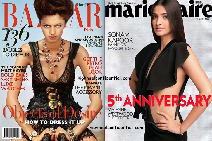
Both MarieClaire and Bazaar gave us super strong covers this June. One was starkly minimal, the other, not so much… But both were fabulous! We like.
We can’t pick a favorite… Can you?
|
Left: Jyothsna Chakravarthy For Harper’s Bazaar, June 2011
Right: Sonam Kapoor For Marie Claire, June 2011
Photo Credit: Viral Bhayani

sonam.. hands down.. for the love of minimalism..
Marie Claire.
The model on HB’s cover looks SO THIN. I don’t like it at all. :/
I agree… the extremely protruding collar bones, the deep neckline and that ugly necklace – all make her look thin to the point of sickness.
And somehow, the dress with sonam’s pose (stomach kinda pushed out) also doesnt look that elegant…but its certainly the better of the 2.
I agree! She looks SCAAARRY!! The moment I saw her on the cover…it reminded me of…a BULL..exceptthat the horns are shooting out of her collar area….EWWWW!!!
Wow! Thats a bold cover from sonam :)
Loving Sonam’s cover! Natural, elegant and minimalistic. God, she gives good face!
What’s up with the model’s expression? It’s totally ridiculous. Anything in the name of being edgy and high fashion, eh?
The model is gorgeous.She looks like Charlize Theron
:/ they are both weird. one is scary the other is…empty. too empty.
Sonam gone too bold , dont like
I don’t like either. Sonam looks aged in this. (A bit like Tabu, don’t you think?) and the other cover- the accessories look like a random addition to the entire get up with way too much going on as it is. And with the colours in the outfit, I wish theyd gone for a darker lighting and background. :\
I agree..Sonam looks plain drab
Do not like the Bazaar cover… Jyotsna tries to look fierce, ends up looking angry. And it’s a strange angle…
Sonam, on the other hand, is beautiful.
wow the hb chick screams international, sonam i love for her fabulous look.
i love how sonam can pull off such daring cuts so elegantly! the dress is fab on her!
Am I the only one who thinks Sonam looks ridiculous?!
Jyothsna seems to be wearing an Alexander McQueen belt..love that and the neckpiece.
Doesn’t Sonam look a bit nekkid in this one? :S
If she was doing something art noveau she could have done something with her hair. But this pic looks like, “hey look folks, I have a flat stomach”
Sonam can do much better.
Sonam looks fab. This lady is unpredictable, never thought she could go so bold and look so great.
At quick glance I thought it was Tabu instead of Sonam!
Sonam fo’ shizzle! Such a classy, serene cover.
Jyothsna Chakravarthy is skinny as a fiddle and the collar bones popped like that look awkward.
Sonam..hands down..just for the bold statement !
soooooooooooooonam
Neither. Hate Sonam’s hair. Hate those over protruding collar bones…and I can’t make out much of the dress since that necklace take all the focus…I like Sonam’s dress though, better hair…a little natural gloss and some accessories would have done the job.
For jyotsana, better expressions and a big fat punjabi meal would help her…I love the bracelet though!
sonam so resembles Tabu in dis..d dress is too showy.. dnt like it…Sonam is my style icon…and i love the fact that shes never exposes and always wearssuch classy attires that dis one looks so unlike her…
i mean that dress..what is it…shes such a practical fashion icon that dis one is definitely a big NO from me….
Sonum looks fab..the model on the other cover looks angry n bored.
Wayyy too much obvious airbrush/photoshop on the Harper’s Cover! Makes the image appear like CG almost! Marie Claire on the other hand is effortlessly sexy and real
Sonam looks fab as always!!! Shes the ultimate cover girl!
Sonam looks insanely fabulous in YSL – who wouldn’t. Marie Claire steals the show this month
Hasn’t ANYONE noticed Sonam’s limpid, un-styled hair and lack of initiative on the part of the makeup artist?
As for Jyothsna…yes, she’s too thin and we all want to be that size…so let’s not criticize that.
Maybe the necklace is a bit much, but otherwise, the HB cover works. She’s looking a bit ferosh, and nothing wrong with that….at least it’s better than having no attitude whatsoever on a face like Sonam’s…