Couple Talk
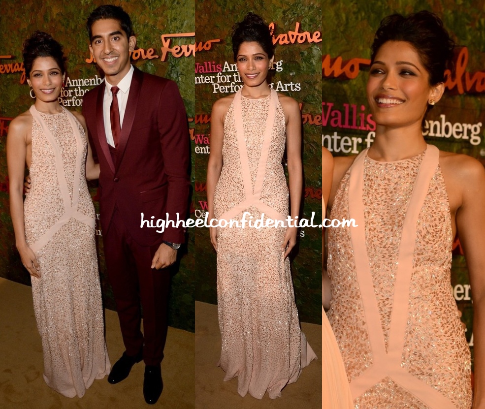
Freida and Dev attended the Performing Arts Inaugural Gala on Thursday night with the former wearing a Ferragamo gown.
I love how Dev’s dark maroon suit complements the blush pink gown. Together, they looked just perfect.
P.S. Happy Birthday Freida.
|
Freida Pinto and Dev Patel at Performing Arts Inaugural Gala
Photo Credit: Viral Bhayani



Ms. Pinto is giving so Hollywoodish vibe here….we dont spot maroon suit often but i have to say suit complementing the gown well :P
They look lovely together. Love Frieda’s gown.
First thing that came to mind – effortless….
At the cost of commoditizing dev – he’s her perfect accessory/arm candy. N smartly she gave the clutch a miss.
Love! Freida looks stunning and Dev is working that burgundy suit! They complement each other perfectly.
Nice to see the you finally updated the layout but you need to make some changes.
The black bar at the top is so wide that I can’t even see the picture in one shot, and my screen is 13.3. So annoying.
New page is not friendly for commenting, I don’t understand all this extra space.
Thanks for the feedback and keep ’em coming! When you mean extra space, do you mean how big the textbox is?
The centre align I dont like. The black box on the top is really irritating. zoom feature is lovely…A good idea would be to have all the ads right aligned and your headings left aligned so that we know what to focus on. You can can also ad a vertical line to separate your posts from what’s in the side. That way its nicely segregated.
I have been a follower of HHC for 7 years. This is my first comment. Love what you do here but totally missing the black background. Your page had an edge to it because of the colour. Unless it is for some technical reasons please bring it back…
I miss the comments preview..dont like to click on the ‘recent comment’ just to see a ‘+1’
I agree with most of the comments above regarding the change in lay-out.
1. When it aint broke, why fix it? Most websites now go for this sort of sleek-minimalist approach in shades of white and grey. HHC stood out for its black moody backdrop which served as a perfect foil for the colourful photographs. Even if you wanted to change the black, wish it were a smoother transition.The white is too stark a contrast for the conditioned eyes.
2. The ad-box on the top of the page which covers a solid quarter of the viewing screen at all times (as it seems to swallow the top part of the screen even when you scroll down) is IRRITATING, to say the least.
3. Like the new font and the spacing between the lines.
4. Zoom feature serves well.
5. Lack of any vertical lines whatsoever (cutting the white spread), makes it appear less sharp. Please ask ur designer to look into it.
Kudos to you!
Dev looks uber nice. I am not a fan of that gown and def dislike it on Freida.
I already miss the black background. And like someone mentioned above, it gave a different touch to HHC. Can we have it back? This seems like so many other blogs with the white color scheme.
Please bring back the earlier colour scheme..the black background used to highlight the pictures beautifully, now there r just sooo many different colours n boxes spread out all over…so much so, that it takes an effort to keep the focus on the pictures concerned !!( no really !) i get it that u were probably inclined towards a look similar to other fashion blogs( Redcarpet_fashion awards maybe?) but to me it looks more like a miss malini page ! sorry, appreciate the efforts, but please please bring back the black background colour ! i dont like looking at the site in its current form…. :(
I’m gonna chime in as well and say that I loved the black background. The white is just too stark and the black really showcased the pictures.
Hi,
Nice layout, but I think the white background is really jarring and doesn’t make for a good foil to the photos. Please try to bring the black background back!
I agree with others here! Bring the black back! The white is sooo typical of other blogs, and really hurts the eyes!!
While you upped the ante with the zoom feature, you negated it with the white background. It is just too jarring to the eyes. Please bring the black background back!
I miss the old background… Maybe i am just too used to it…or maybe it was really better. I dont know. But pls bring it back. The zoom feature is cool though.
Lust (sigh)..first Dev Patel and then that dress:)
The color is perfect and the dress is very minimalist chic!
Hi PnP…u guys really drawing some kinda pleasure out of inflicting the stark white background on us which soo many of us openly admit to hating?! i can see almost everyone asking to have the black-background back..but u wont reply to that at all ! pardon me but i really am peeved looking at the garish light coming from my screen!(feels like am looking at a CFL lamp!!!) if it isnt a lot of hassle, then please do try to change the background. if not, then just say that it won’t happen..atleast i’ll pipe down!!! thankyou… :(
Any feedback that’ll help us improve the functionality is welcome and we’ll make changes/tweaks in the next few days as and when we find issues. But the design part, specifically with regards to white- That’s here to stay. Just give it some time! :)