Asin On Grazia: (Un)Covered
Sculpted shoulders being the norm for Fall and green one of it’s (Fall’s) hottest hues, it doesn’t surprise us to see this dress on the latest cover of Grazia’s, nor the background. Do however like the way they both came together.
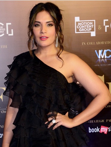
We love how Grazia never shies away from using color, this cover being no different. Love the dramatic contrast between the black Louis Vuitton dress on Asin and the oh-so-green background.
P.S: The necklace on Asin is Dolce and Gabbana.

|
Left: Louis Vuitton, Pre-Fall 09
Right: Asin, Grazia Nov 09
Photo Credit: Grazia, Style
she doesn’t look fierce enough to pull off such a dramatic look.
agreed ……..plus she has been photoshopped
Don’t LOVE the dress it’s very okay. Is the dress on the left the same as the one Asin has on? Because the shoulders on the one on the left are a LOT nicer .. Don’t like the necklace with this dress, the styling is all wrong! Asin looks nice, but her eyes are dead..I don’t like this cover at all..I wouldn’t buy the magazine by looking at the cover. It looks like it should be an ad for a funeral house.
Of all the Asin looks, this one is a definite upgrade. She doesnt look fierce but she atleast managed that “do i look like i give a damn” vibe.
she doesnt have the grace and the figure to carry such dresses
I didn’t even recognize asin..
Me neither!
Me neither … !!
she looks stunning and makes the whole look very posh! :) like the cover, that green is lovely.
such a serene face.
Snore. I prefer Deepika’a cover.
Contrary to popular opinion, I love the concept of the cover: the juxtaposing of the edgu, masculine dress and the statement necklace against the serene, minty green background and that ultra feminine face.
Like I said I like the CONCEPT, but some how it isn’t well executed .The fake, photoshopped pout iss such a jarring element. And also, Asin’s pose. A different pose and she would carried off the tricky silhoutte beautifully.
But most of all those eyes, their lifelessness makes the whole thing fall. flat.
the contrast is great…her face also stands out. but this pose was neither fierce, nor subtle. so it doesnt have a lot of appeal.
the green backround is lovely. asin herself looks very drab. also the way she has been positioned on the cover she looks serpentine in some way..fierce she is not..atleast on this cover.
as with her other apperances, she hardly brings anything to the dress!!
she look nice
Is that girl totally incapable of expression!? Such a pretty face but oh-so-boring!
I love this cover, I do not think Asin’s pout has been photoshopped. Am amazed that for girl who came across so vibrant and alive on screen in Ghazini looks so lifeless here. But the cover still works coz of the colours. Also love the dress AND the necklace
This is one of the more boring Grazia covers.
im just not feeling it… it seems to oring for me !!
*boring
Hi P&P
could you do a comparison feature with Asin on the new FHM cover?
can u editors only think of deepika, bipasha, katrina, and kareena for yr covers?? i suppose there are no other interesting indian s?? seriously!
that color of green is like the reject sale lot!
it’s the hair
and maybe the quote, lol
HAHAHA
switch asin with any fiesty model… and this cover rocks.
I like it. Love the minty green background! Asin looks beautiful and much better compared to many other covers. The expressionless,dead eyes are a turn-off though.
Wow! Asin’s lookin class here…love the dramatic look…and also digin the accessory
LOVE the dress.
Hate that they paired the necklace withi it on the cover.
Asin is always gorgeous